Equities Dashboard
Evolving a public equities dashboard around the realities of an emerging stock market.
The Dominican Republic's equities market was still taking shape. As new listed companies entered the market, BVRD needed to evolve an existing dashboard into a clearer and more scalable way for investors and market participants to understand prices, trading activity and market behavior.
- Organization
- Bolsa de Valores de la República Dominicana
- Year
- 2024
01 Context
A dashboard for a market that was still taking shape
BVRD's first equities dashboard was introduced in the context of the arrival of the first publicly traded stock in the Dominican market. It gave the public a dedicated place to follow the instrument, understand its latest price and explore trading activity.
As the market expanded and additional listed companies were introduced, the product needed to evolve with it. Feedback and requirements received by BVRD from brokerage firms and end users, together with limitations in the existing experience, became the starting point for a second version.
Market evolution
- 01 First listed equity
- V1 Initial equities experience
- V2 Evolving market experience
02 The existing experience
The first version exposed what the product needed next
The first release established the foundation, but real-world use exposed limitations that became more important as the equities market evolved.
Some parts of the interface were visually fragmented or did not behave consistently. Other areas dedicated significant space to market information that could provide limited value depending on actual trading activity and liquidity. At the same time, requirements reaching BVRD from brokerage firms and end users created new expectations for what the dashboard should communicate.
The challenge was not simply to modernize the interface. It was to reconsider which market information deserved attention, what could be simplified, and how the experience should organize financial data for a broad public audience.
What should the dashboard show when more data doesn't necessarily mean more useful information?
[ Visual 02 ]
V1 — existing experience
[ 16:9 ]
[ Visual 02 ]
V1 — existing experience
Large screenshot of the original equities dashboard. This visual will be used to establish the starting point before the redesign.
Wide desktop screenshot. The four notes below are written to sit alongside it once it exists.
What the first version made visible
- 01
Fragmented hierarchy
Different market concepts competed for attention without a sufficiently clear reading order.
- 02
Low-value states
Some areas could occupy substantial interface space even when market activity provided little information to display.
- 03
Information density
Financial information was available, but its relative importance was not always immediately apparent.
- 04
Interface consistency
Parts of the existing experience required visual and interaction refinement as the product evolved.
03 Product thinking
Designing for the market we actually had
Financial products can easily become exercises in displaying every available metric. For V2, the objective was different: the interface had to reflect how the Dominican equities market was actually being used.
That meant questioning elements inherited from the first version rather than automatically preserving them. Business requirements had to be balanced against the usefulness of the information, the frequency with which meaningful data would actually be available, and the amount of attention each component consumed on screen.
The resulting experience prioritized signals that could help users answer practical questions quickly.
The questions the interface has to answer
- 01
What am I looking at?
- 02
What is the latest price?
- 03
What is the market showing?
- 04
Who is participating?
- 05
How has it behaved?
04 Information hierarchy
Rebuilding the information hierarchy
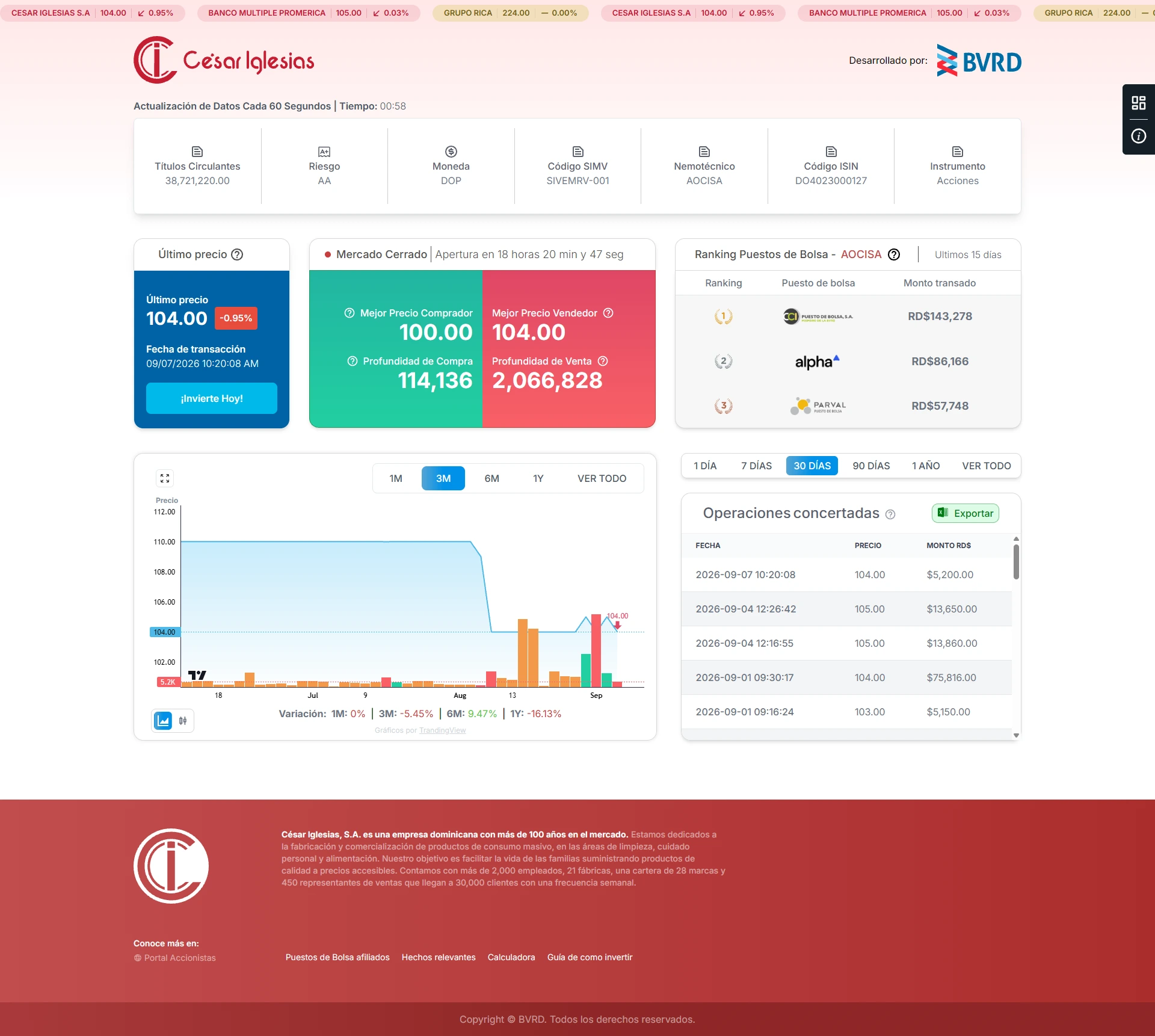
V2 reorganized the experience around a clearer progression from instrument identity to current market state and historical behavior.
Instead of treating every dataset as equally important, the interface establishes layers: security information provides context, current pricing communicates the immediate market state, brokerage activity adds participation context, and historical data helps users understand behavior over time.
[ Visual 03 ]
V2 — information anatomy
[ 16:9 ]
[ Visual 03 ]
V2 — information anatomy
Annotated V2 screenshot. Use five restrained numbered markers to identify the main information layers. Do not add arrows or explanatory paragraphs over the interface.
Marker legend below.
Marker legend
- 01 Instrument context
- 02 Current market state
- 03 Market participation
- 04 Market behavior
- 05 Trading activity
05 V1 → V2
Evolution, not a cosmetic redesign
The second version was not approached as a visual facelift. It was an opportunity to reconsider the product after its first period of real-world use and prepare the experience for a broader equities market.
[ Visual 04 ]
V1 → V2 product evolution · V1
[ 4:3 ]
[ Visual 04 ]
V1 → V2 product evolution · V2
[ 4:3 ]
[ Visual 04 ]
V1 → V2 product evolution
Side-by-side comparison using the original V1 screenshot and the final V2 screenshot. Match equivalent regions where possible so the evolution in hierarchy and composition can be understood quickly.
Static two columns for now — no before/after slider.
-
Clearer hierarchy
The most important market signals became easier to identify and scan.
-
Information with a purpose
Components were reconsidered according to the usefulness of the information they provided within the context of the local market.
-
A system that could evolve
The experience moved beyond the context of the first listed stock toward a structure capable of supporting a growing equities market.
06 From design to code
Design decisions informed by implementation
My role extended beyond defining the experience. I worked across product coordination, interface design and front-end implementation, translating parts of the redesigned experience into a responsive production interface.
Building parts of the product also meant confronting design decisions with real technical constraints. Charting libraries were explored and evaluated against the information the product needed to communicate, and the selected approaches were integrated into the responsive experience.
Working across design, product and implementation reduced the distance between what was proposed and what could actually be delivered.
How the work moved
- Product requirements
- Experience
- Front-end
What the implementation had to hold
- Market data
- Responsive behavior
- Charting libraries
- Production constraints
[ Visual 05 ]
Responsive experience · Desktop
[ 16:10 ]
[ Visual 05 ]
Responsive experience · Mobile
[ 9:16 ]
[ Visual 05 ]
Responsive experience
Desktop and mobile product views demonstrating how the information hierarchy adapts across screen sizes. Add the real responsive screenshots here when available.
Keep the placeholder until a real mobile screenshot exists.
07 Outcome
A product that evolved with its market
The second version became the evolution of BVRD's public equities experience, incorporating what had been learned from the first release while supporting a broader market context.
The project reinforced a principle that became increasingly important in my work: financial interfaces are not improved by exposing more data, but by making deliberate decisions about which information helps people understand what is happening.
-
Product
Evolved an existing public market product as the equities market expanded.
-
Design
Reconsidered hierarchy and information value around actual market behavior.
-
Delivery
Worked across team coordination, product design and responsive front-end implementation.